
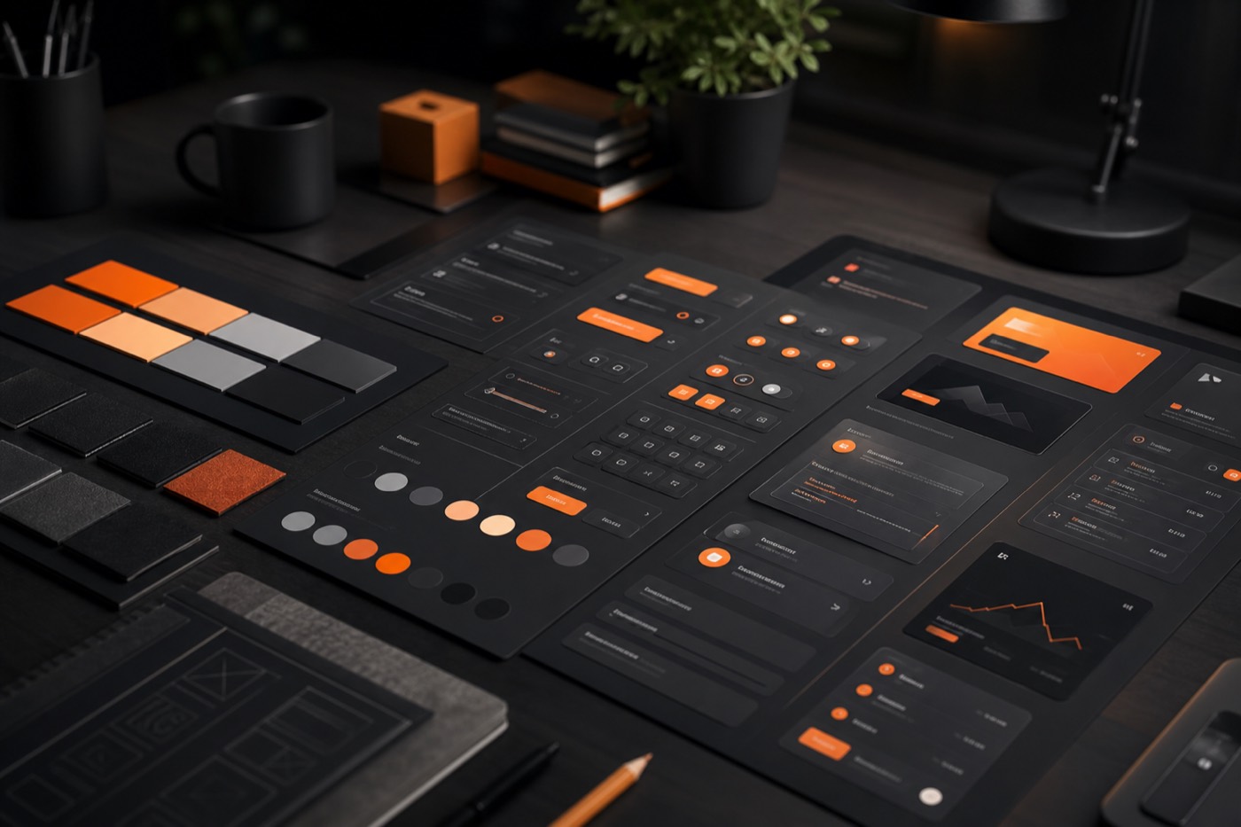
A design system should speed teams up — not trap them in rigid screens that never evolve.
Start with foundations, not a giant library
Color, type, spacing, and elevation tokens create shared language between design and engineering. Once foundations are stable, components become easier to reuse and safer to change.
Contribution beats perfection
The best systems include a clear path for product teams to propose variants. We document:
- When to reuse an existing pattern
- When a new component is justified
- How accessibility and responsive behavior are validated
Keep product voice intact
Consistency does not mean every page looks identical. Brand personality lives in motion, illustration, and content hierarchy — while components protect usability and shipping speed.
If your UI feels fragmented, audit your tokens first. Most “component chaos” is really foundation drift.